About Secure the Perimeter Podcast
Secure the Perimeter is a podcast dedicated to helping leaders build strong lives, unshakable businesses, and lasting legacies by protecting what matters most. The show focuses on cybersecurity leadership, business resilience, and the strategic thinking needed to safeguard organizations in an increasingly digital world.
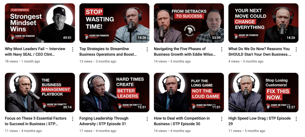
The Visual Challenge

In YouTube’s ultra-competitive landscape, your thumbnail is your first impression—and often your only chance to capture a viewer’s attention. When Medium Interactive took on the challenge of revamping thumbnails for the Secure the Perimeter podcast, they discovered just how much impact smart visual design can have on audience growth.
The leadership-focused podcast was struggling with bland, templated thumbnails that failed to communicate the compelling content within each episode. Through strategic redesign rooted in design psychology and YouTube best practices, the team transformed these overlooked visuals into click-worthy assets that now drive stronger engagement and brand recognition.
The Problem: When Consistency Becomes Invisibility

The original approach seemed logical enough—maintain brand consistency with uniform grey templates across all episodes. But consistency taken too far can work against you on a platform where standing out is everything.
The issues were clear:
- Episodes blended together in viewers’ feeds
- Key topics weren’t highlighted effectively
- The muted color palette failed to compete with more vibrant content
- Click-through rates remained disappointingly low
As any content creator knows, even the most valuable podcast content can go unnoticed if the packaging doesn’t invite people to click. The Secure the Perimeter team needed thumbnails that could cut through the noise.
The Strategy: Psychology Meets Design Best Practices
Medium Interactive’s approach went beyond simple aesthetic improvements. They applied proven thumbnail optimization techniques while leveraging psychological principles that influence viewer behavior:
Visual Impact Improvements
- High-contrast color schemes that pop on both mobile and desktop screens
- Large, readable typography with punchy keywords that communicate episode value instantly
- Strategic use of faces and directional cues to guide the viewer’s eye toward key information
- Topic-focused messaging rather than generic branding
Psychological Triggers
- Curiosity gaps created through compelling visual questions
- Urgency indicators that suggest timely, must-watch content
- Social proof elements when featuring recognizable industry experts
- Emotional resonance through strategic use of expressions and imagery
The Results: From Overlooked to Unmissable

The transformation didn’t just improve aesthetics—it fundamentally changed how the podcast appears in YouTube’s ecosystem. Each episode now has its own visual personality while maintaining the overall brand identity that makes Secure the Perimeter instantly recognizable.
Key improvements include:
- Increased click-through rates as thumbnails now compete effectively in crowded feeds
- Better topic communication helping viewers quickly identify relevant episodes
- Stronger brand recognition through consistent yet varied visual styling
- Mobile optimization ensuring thumbnails perform well across all devices
The podcast now stands out among cybersecurity content, with thumbnails that clearly communicate value propositions and invite clicks from both existing subscribers and new viewers discovering the content through search and recommendations.
Lessons for Content Creators
Design Fundamentals Matter
Your thumbnail is essentially a movie poster for your content. It needs to work at small sizes, communicate clearly, and create enough intrigue to warrant a click. Don’t underestimate the power of bold, readable text and high-contrast visuals.
Topic Over Brand
While brand consistency is important, your thumbnail’s primary job is to communicate what this specific episode offers viewers. Leading with compelling topics rather than just logo placement often yields better results.
Mobile-First Thinking
With the majority of YouTube viewing happening on mobile devices, your thumbnails must be optimized for small screens. If the text isn’t readable on a phone, you’re losing potential viewers.
Psychology Drives Action
Understanding what motivates clicks—curiosity, urgency, social proof—allows you to craft thumbnails that tap into these fundamental human drivers. It’s not manipulation; it’s effective communication.
The Bigger Picture
Medium Interactive’s work with Secure the Perimeter demonstrates that thoughtful design changes can deliver disproportionate returns on investment. In a platform where algorithms favor engagement, better thumbnails create a positive feedback loop: more clicks lead to better distribution, which leads to more opportunities for clicks.
For cybersecurity professionals and enthusiasts, this means higher-quality content is now more discoverable. For content creators in any niche, it’s a reminder that the visual presentation of your work is just as important as the content itself.
The transformation from generic templates to psychologically-optimized, topic-focused thumbnails shows what’s possible when design expertise meets platform-specific strategy. In YouTube’s attention economy, sometimes the smallest changes make the biggest difference.